Home »
The Secret Behind Why Most Coconut Oil Bottles Are Blue


The Secret Behind Why Most Coconut Oil Bottles Are Blue
(And what it teaches you about brand recall)
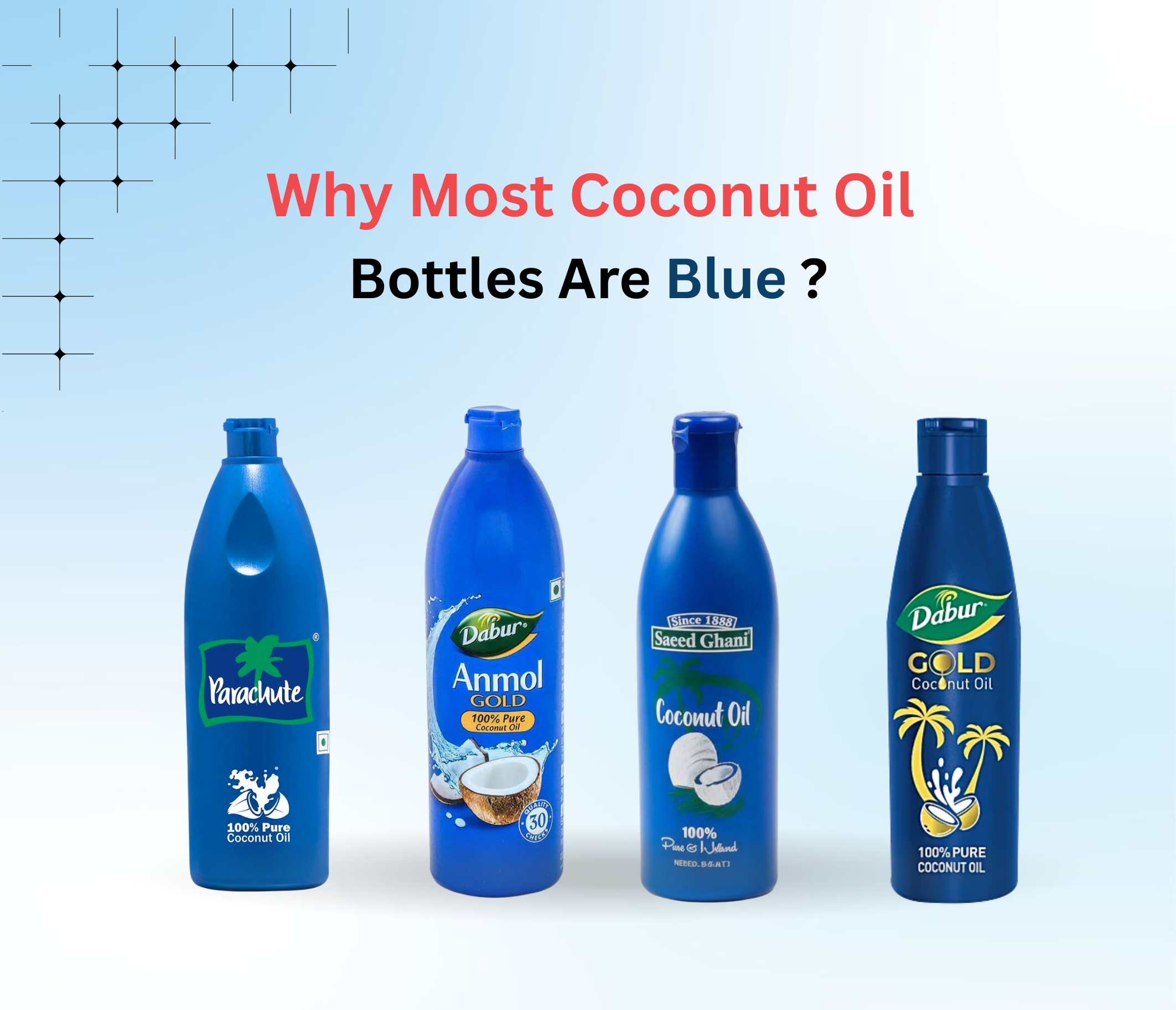
Walk into any Indian grocery store and stop in front of the coconut oil shelf.
What do you see?
A whole ocean of blue bottles staring back at you.
Coincidence?
Not even a little.
This isn’t “everyone copied everyone.”
This is one of the smartest, most underrated moves in Indian branding history.
A move so powerful, the entire category started speaking the same color.
Welcome to Category Code Adoption — or as I like to call it:
The Blue Bottle Effect.
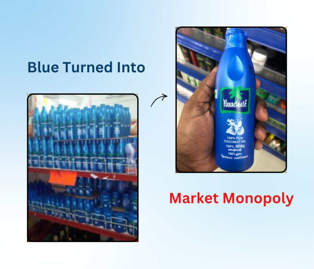
How One Brand Turned Blue Into a Market Monopoly
Parachute didn’t just sell coconut oil; they sold an identity.
A feeling.
A color.
For millions of Indians, coconut oil = blue bottle.
The association became so strong that when competitors entered the market, they didn’t try to fight the color…
they simply adopted it.
Because why battle a code the consumer already believes in?
Why fight the shortcut that already lives in their mind?
That’s the genius.
Parachute didn’t just dominate the shelf; they dominated mental real estate.
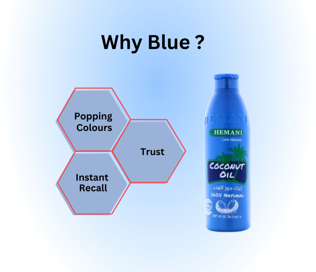
So Why Blue? Why Not Green or Brown or “Coconut Colour”?
Let’s decode the psychology — because this wasn’t random.
1. Blue = Trust
Blue in branding triggers feelings of reliability, safety, and purity.
In a category where the promise is “pure coconut oil”, blue does a lot of heavy lifting without saying a word.
2. Blue Pops on Indian Shelves
Look at our kirana stores:
Brown dals, green moong, red masalas, yellow besan…
Among all this chaos?
A solid blue bottle stands out like a lighthouse.
3. Blue Created Instant Recall
Consumers don’t read labels.
They recognize shapes and colors.
That “aah haan, yeh wala” moment at the shelf?
That’s coding + recall working together.
Category Code Adoption: The Strategy Behind the Scene
Clever brands don’t always try to look different.
Sometimes they try to look right.
A category code is a visual language that consumers already trust —
colors, shapes, sounds, packaging styles that feel familiar and safe.
By adopting these codes, brands reduce friction.
The brain doesn’t have to decode anything new.
It already knows what the product is supposed to look like.
In simple words:
Brands win when consumers don’t have to think too much.
Why The Blue Bottle Effect Still Works in 2025
Even today, you walk into a store, and instinctively your eyes go to the blue.
You might be planning to compare brands, prices, or purity levels…
but your hand automatically reaches for the blue one.
That’s not “habit.”
That’s brand conditioning at its absolute finest.
And once a brand becomes the category code, the game is rigged in its favor.
Everyone else looks like the dupe — even if the formula is the same.

Marketing Lesson for 2025 (and Beyond)
Not every brand needs a 100-ad campaign.
Not every brand needs a viral jingle.
Sometimes the most powerful branding decision is just one thing:
Consistency.
One color.
One shape.
One visual memory that never changes.
Because when consumers trust a code, you don’t just build recognition…
you build reflex.
And reflex?
That’s the holy grail of marketing.
Final Thought: You Don’t Need to Shout to Be Remembered
Parachute didn’t go blue to be cute.
They went blue to be recognizable.
And in doing so, they built one of the strongest brand identities India has ever seen —
without ever having to scream for attention.
Great branding is not louder.
It’s clearer.
And if you can own a color the way Parachute owns blue,
you don’t just win the shelf…
you win the mind.